
Android Icons
Material Symbols icons for the Android Compose surface
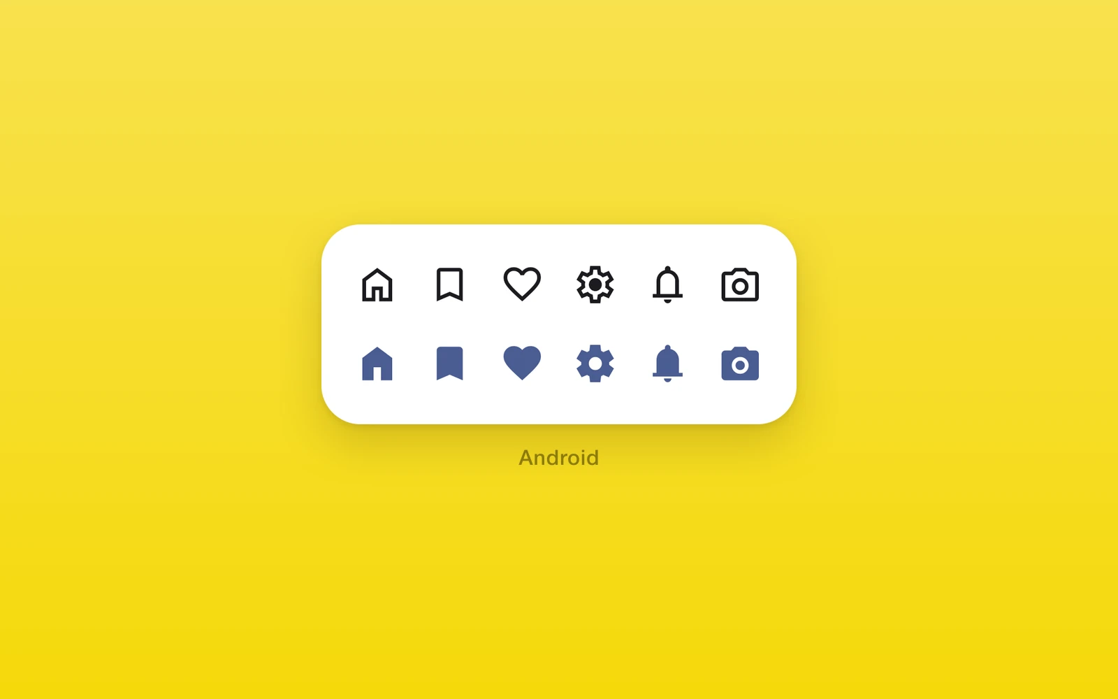
One.Android.Icon draws a Material Symbols icon inside a Compose tree.
The outlined and filled fonts are bundled, so icons render offline and
without a frame of delay.
import { One } from 'one'
<One.Android.Row spacing={12}> <One.Android.Icon name="star" filled composeStyle={{ foregroundColor: '#FFC107' }} /> <One.Android.Button label="Next" icon="arrow_forward" onPress={next} /></One.Android.Row>| Props | Type | Description |
|---|---|---|
name (required)ComposeIconNameA Material Symbols name, such as star or arrow_forward. | ComposeIconName | A Material Symbols name, such as star or arrow_forward. |
sizenumber = 24The size in dp. Must be positive. | number = 24 | The size in dp. Must be positive. |
filledboolean = falseThe filled glyph instead of the outlined one. | boolean = false | The filled glyph instead of the outlined one. |
name takes the snake_case names from
fonts.google.com/icons. ComposeIconName
lists all 4,284, so a typo fails type checking, and an unknown name throws
when the icon renders.
The icon also takes the shared node props from
Compose: composeStyle.foregroundColor tints
it, and an accessibilityLabel makes it read aloud; without one it is
decorative. A Button’s icon and iconFilled take the same names and
follow the button’s content color.
For an icon that also renders on iOS and web, use
One.UI.Icon, which takes a separate icon for each
platform.
These components throw when rendered outside an Android build, so keep those branches behind platform checks.
Edit this page on GitHub.