iOS Navigation and Toolbar
NavigationStack, Toolbar, ToolbarItem, ToolbarItemGroup, and ToolbarSpacer under One.iOS
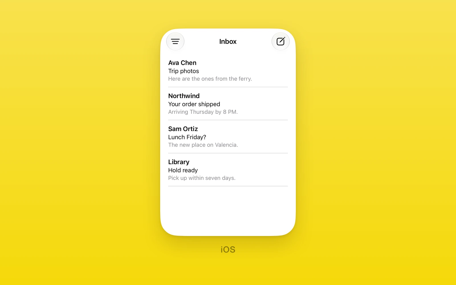
Navigation chrome under One.iOS. This is the SwiftUI toolbar that fills
the navigation bar, distinct from the UIKit navigation toolbar
(One.iOS.ToolbarHost and One.iOS.BarButtonItem) covered in
Toolbar and Menus.
NavigationStack
One.iOS.NavigationStack is a SwiftUI navigation stack whose root is the
React Native content beside it. Children are Toolbar elements (which fill
the navigation bar) or React Native content; ToolbarItem,
ToolbarItemGroup, and ToolbarSpacer belong inside a Toolbar, never
directly in the stack. Navigation title, title display mode, and every
other scalar navigation or toolbar modifier reach the stack through
swiftStyle, so the bar has no bespoke props.
import { One } from 'one'
<One.iOS.NavigationStack> <One.iOS.Toolbar> <One.iOS.ToolbarItem placement="primaryAction"> <One.iOS.Button label="Save" onPress={save} /> </One.iOS.ToolbarItem> </One.iOS.Toolbar> <Content /></One.iOS.NavigationStack>| Props | Type | Description |
|---|---|---|
children (required)ReactNodeToolbar elements and the root content. | ReactNode | Toolbar elements and the root content. |
Set the title with swiftStyle, for example
swiftStyle={{ navigationTitleWithText: 'Mailbox', navigationBarTitleDisplayMode: 'inline' }}.
Toolbar
One.iOS.Toolbar becomes one native toolbar. Its children must be
ToolbarItem, ToolbarItemGroup, or ToolbarSpacer elements in order,
and the stack merges every toolbar it is given. One.iOS.Tabs also takes a
Toolbar child.
| Props | Type | Description |
|---|---|---|
children (required)ReactNodeToolbarItem, ToolbarItemGroup, and ToolbarSpacer elements. | ReactNode | ToolbarItem, ToolbarItemGroup, and ToolbarSpacer elements. |
ToolbarItem
One.iOS.ToolbarItem places one item in the bar.
| Props | Type | Description |
|---|---|---|
placementToolbarItemPlacement = "automatic"Where the item goes. See below. | ToolbarItemPlacement = "automatic" | Where the item goes. See below. |
children (required)ReactNodeThe item, such as a One.iOS.Button. | ReactNode | The item, such as a One.iOS.Button. |
ToolbarItemPlacement is every SwiftUI placement: automatic, principal,
navigation, primaryAction, secondaryAction, status,
confirmationAction, cancellationAction, destructiveAction, keyboard,
topBarLeading, topBarTrailing, topBarPinnedTrailing,
navigationBarLeading, navigationBarTrailing, title, largeTitle,
bottomBar, subtitle, and largeSubtitle. A placement newer than the
running iOS throws.
ToolbarItemGroup
One.iOS.ToolbarItemGroup places several items together.
| Props | Type | Description |
|---|---|---|
placementToolbarItemPlacement = "automatic"Where the group goes. | ToolbarItemPlacement = "automatic" | Where the group goes. |
labelstring = ""Names the group when SwiftUI collapses it. | string = "" | Names the group when SwiftUI collapses it. |
systemImagestring = ""An SF Symbol with the label. Needs a label. | string = "" | An SF Symbol with the label. Needs a label. |
children (required)ReactNodeThe items. | ReactNode | The items. |
ToolbarSpacer
One.iOS.ToolbarSpacer spreads toolbar items apart. It needs iOS 26.
| Props | Type | Description |
|---|---|---|
sizingSpacerSizing = "flexible"flexible fills the space; fixed adds a standard gap. | SpacerSizing = "flexible" | flexible fills the space; fixed adds a standard gap. |
placementToolbarItemPlacement = "automatic"The bar the spacer sits in. | ToolbarItemPlacement = "automatic" | The bar the spacer sits in. |
On web and Android these views throw. Keep them behind a platform check.
Edit this page on GitHub.