Presentations and Menus
Sheet, FullScreenCover, Popover, Alert, ConfirmationDialog, QuickLook, Menu, and ContextMenu under One.iOS
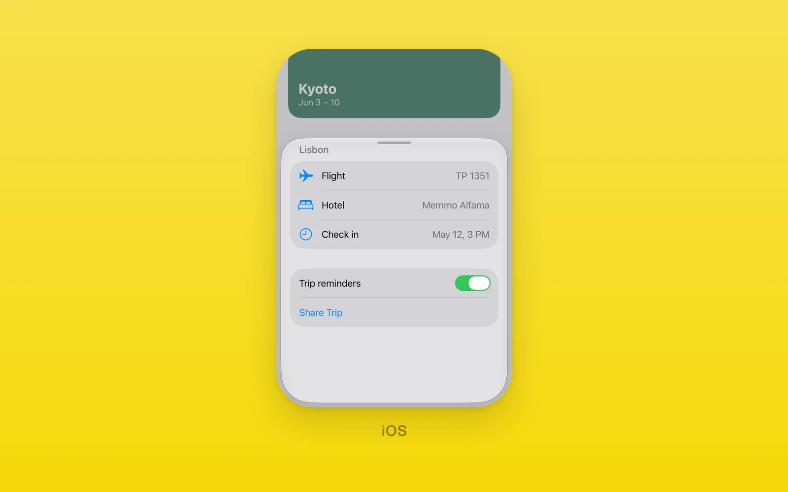
Modal presentations and menus under One.iOS, presented by SwiftUI.
- Every presentation is controlled:
isPresented, anonIsPresentedChangecallback, and arevisionfor external resets. Sheet,FullScreenCover, andPopoverpresent React Native children.AlertandConfirmationDialogtake a list of actions.MenuandContextMenubuild a SwiftUI menu from a list of items.- Every view here throws on web and Android. Keep them in an iOS branch or an
.ios.tsxfile.
Usage
import { useState } from 'react'import { One } from 'one'
export function TripScreen() {  const [open, setOpen] = useState(false)
  return (    <>      <One.iOS.Button label="Details" onPress={() => setOpen(true)} />      <One.iOS.Sheet        isPresented={open}        onIsPresentedChange={setOpen}        presentationDetents={['medium', 'large']}        presentationDragIndicator="visible"      >        <TripDetails />      </One.iOS.Sheet>    </>  )}
onIsPresentedChange(false) asks React to close the presentation, after a
swipe down or a tap outside. Accept it by setting the state, or decline it by
leaving isPresented true. To change the presentation from outside, set the
new value and increase revision in the same render.
Sheet
One.iOS.Sheet presents its children in a sheet.
| Props | Type | Description |
|---|---|---|
isPresented (required)booleanWhether the sheet shows. | boolean | Whether the sheet shows. |
onIsPresentedChange (required)(value: boolean) => voidA native open or close request. | (value: boolean) => void | A native open or close request. |
onDismiss() => voidSwiftUI began dismissing the sheet. | () => void | SwiftUI began dismissing the sheet. |
onDidDismiss() => voidThe sheet left the screen. See below. | () => void | The sheet left the screen. See below. |
revisionnumber = 0Increase with a new isPresented to reset it from outside. | number = 0 | Increase with a new isPresented to reset it from outside. |
presentationDetentsreadonly PresentationDetent[] = ["large"]The heights the sheet rests at. Each must be unique. | readonly PresentationDetent[] = ["large"] | The heights the sheet rests at. Each must be unique. |
fitToContentsboolean = falseSizes the sheet to its content. Not with selectedDetent. | boolean = false | Sizes the sheet to its content. Not with selectedDetent. |
selectedDetentPresentationDetentThe current detent, controlled. Pass with its callback. | PresentationDetent | The current detent, controlled. Pass with its callback. |
onSelectedDetentChange(detent: PresentationDetent) => voidA drag to another detent. | (detent: PresentationDetent) => void | A drag to another detent. |
detentRevisionnumber = 0Increase with a new selectedDetent to reset it. | number = 0 | Increase with a new selectedDetent to reset it. |
presentationDragIndicatorVisibility = "automatic"automatic, visible, or hidden. | Visibility = "automatic" | automatic, visible, or hidden. |
interactiveDismissDisabledboolean = falseBlocks swiping the sheet away. | boolean = false | Blocks swiping the sheet away. |
presentationBackgroundColorValueThe sheet color. System material when unset. | ColorValue | The sheet color. System material when unset. |
presentationBackgroundInteractionPresentationBackgroundInteraction = "automatic"Whether the screen behind takes touches. See below. | PresentationBackgroundInteraction = "automatic" | Whether the screen behind takes touches. See below. |
presentationContentInteractionPresentationContentInteraction = "automatic"automatic, resizes, or scrolls: what a swipe on content does first. | PresentationContentInteraction = "automatic" | automatic, resizes, or scrolls: what a swipe on content does first. |
presentationSizingPresentationSizing = "automatic"automatic, fitted, form, or page. | PresentationSizing = "automatic" | automatic, fitted, form, or page. |
children (required)ReactNodeThe sheet content. | ReactNode | The sheet content. |
A PresentationDetent is 'medium', 'large', { fraction } from 0 to 1,
or { height } in points. presentationBackgroundInteraction is
'automatic', 'enabled', 'disabled', or { enabledUpThrough: detent },
which lets the screen behind take touches until the sheet grows past that
detent. The detent must be one of presentationDetents.
onDismiss forwards SwiftUI’s dismissal, which can arrive while the content is
still on screen. onDidDismiss fires once the content has left its window
after an accepted close; a declined close or an unmounted sheet never reports
it. Keep the Sheet and its content mounted until then if you need it.
FullScreenCover
One.iOS.FullScreenCover covers the screen. It has no detents and no swipe to
dismiss, so the content needs its own close control.
import { Button, View } from 'react-native'
<One.iOS.FullScreenCover isPresented={open} onIsPresentedChange={setOpen}> <View style={{ flex: 1 }}> <Button title="Close" onPress={() => setOpen(false)} /> </View></One.iOS.FullScreenCover>| Props | Type | Description |
|---|---|---|
isPresented (required)booleanWhether the cover shows. | boolean | Whether the cover shows. |
onIsPresentedChange (required)(value: boolean) => voidA native open or close request. | (value: boolean) => void | A native open or close request. |
onDismiss() => voidSwiftUI began dismissing the cover. | () => void | SwiftUI began dismissing the cover. |
onDidDismiss() => voidThe cover left the screen. | () => void | The cover left the screen. |
revisionnumber = 0Increase with a new isPresented to reset it from outside. | number = 0 | Increase with a new isPresented to reset it from outside. |
children (required)ReactNodeThe cover content. | ReactNode | The cover content. |
Popover
One.iOS.Popover anchors a popover to its children. On an iPhone it shows as
a sheet unless presentationCompactAdaptation says otherwise.
<One.iOS.Popover isPresented={open} onIsPresentedChange={setOpen} contentWidth={260} contentHeight={120} presentationCompactAdaptation="popover" content={<FilterOptions />}> <One.iOS.Button label="Filter" onPress={() => setOpen(true)} /></One.iOS.Popover>| Props | Type | Description |
|---|---|---|
isPresented (required)booleanWhether the popover shows. | boolean | Whether the popover shows. |
onIsPresentedChange (required)(value: boolean) => voidA native open or close request. | (value: boolean) => void | A native open or close request. |
revisionnumber = 0Increase with a new isPresented to reset it from outside. | number = 0 | Increase with a new isPresented to reset it from outside. |
arrowEdgeEdgetop, leading, bottom, or trailing. SwiftUI picks when unset. | Edge | top, leading, bottom, or trailing. SwiftUI picks when unset. |
presentationCompactAdaptationPresentationAdaptation = "automatic"automatic, none, popover, sheet, or fullScreenCover on compact screens. | PresentationAdaptation = "automatic" | automatic, none, popover, sheet, or fullScreenCover on compact screens. |
contentWidth (required)numberThe popover width in points. Must be above zero. | number | The popover width in points. Must be above zero. |
contentHeight (required)numberThe popover height in points. Must be above zero. | number | The popover height in points. Must be above zero. |
content (required)ReactNodeThe popover body. | ReactNode | The popover body. |
children (required)ReactNodeThe anchor. | ReactNode | The anchor. |
Alert
One.iOS.Alert shows a system alert with one button per action.
<One.iOS.Alert isPresented={confirming} onIsPresentedChange={setConfirming} title="Delete trip?" message="This removes it from every device." actions={[ { id: 'cancel', label: 'Cancel', role: 'cancel' }, { id: 'delete', label: 'Delete', role: 'destructive' }, ]} onAction={(id) => id === 'delete' && deleteTrip()}/>| Props | Type | Description |
|---|---|---|
isPresented (required)booleanWhether the alert shows. | boolean | Whether the alert shows. |
onIsPresentedChange (required)(value: boolean) => voidThe alert closed. | (value: boolean) => void | The alert closed. |
revisionnumber = 0Increase with a new isPresented to reset it from outside. | number = 0 | Increase with a new isPresented to reset it from outside. |
onAction(id: string, presenting: string) => voidA tapped action, with its id and presenting. | (id: string, presenting: string) => void | A tapped action, with its id and presenting. |
titlestring = ""The alert title. | string = "" | The alert title. |
messagestring = ""Text under the title. | string = "" | Text under the title. |
presentingstringA value passed back to onAction, such as the item being deleted. | string | A value passed back to onAction, such as the item being deleted. |
actions (required)readonly DialogAction[]The buttons. At least one, with unique ids. | readonly DialogAction[] | The buttons. At least one, with unique ids. |
A DialogAction is { id, label, role }, where role is a ButtonRole:
'destructive', 'cancel', 'confirm', or 'close'.
ConfirmationDialog
One.iOS.ConfirmationDialog shows an action sheet. It takes every Alert prop
plus titleVisibility.
| Props | Type | Description |
|---|---|---|
isPresented (required)booleanWhether the dialog shows. | boolean | Whether the dialog shows. |
onIsPresentedChange (required)(value: boolean) => voidThe dialog closed. | (value: boolean) => void | The dialog closed. |
revisionnumber = 0Increase with a new isPresented to reset it from outside. | number = 0 | Increase with a new isPresented to reset it from outside. |
onAction(id: string, presenting: string) => voidA tapped action, with its id and presenting. | (id: string, presenting: string) => void | A tapped action, with its id and presenting. |
titlestring = ""The dialog title. | string = "" | The dialog title. |
messagestring = ""Text under the title. | string = "" | Text under the title. |
presentingstringA value passed back to onAction. | string | A value passed back to onAction. |
actions (required)readonly DialogAction[]The buttons. At least one, with unique ids. | readonly DialogAction[] | The buttons. At least one, with unique ids. |
titleVisibilityVisibility = "automatic"automatic, visible, or hidden. | Visibility = "automatic" | automatic, visible, or hidden. |
QuickLook
One.iOS.QuickLook previews a document while isPresented is true.
| Props | Type | Description |
|---|---|---|
isPresented (required)booleanWhether the preview shows. | boolean | Whether the preview shows. |
onIsPresentedChange (required)(value: boolean) => voidThe preview closed. | (value: boolean) => void | The preview closed. |
revisionnumber = 0Increase with a new isPresented to reset it from outside. | number = 0 | Increase with a new isPresented to reset it from outside. |
urlstringA file, http, or https URL. Required at runtime. | string | A file, http, or https URL. Required at runtime. |
Menu
One.iOS.Menu renders its children as the trigger and opens a SwiftUI menu on
tap.
<One.iOS.Menu accessibilityLabel="Options" items={[ { type: 'action', id: 'share', title: 'Share', systemImage: 'square.and.arrow.up' }, { type: 'divider', id: 'sep' }, { type: 'action', id: 'delete', title: 'Delete', role: 'destructive' }, ]} onAction={(id) => act(id)}> <One.iOS.Image systemName="ellipsis.circle" /></One.iOS.Menu>| Props | Type | Description |
|---|---|---|
items (required)readonly MenuItem[]The menu content. See below. | readonly MenuItem[] | The menu content. See below. |
onAction (required)(id: string) => voidA tapped action item. | (id: string) => void | A tapped action item. |
primaryAction() => voidRuns on tap; the menu then opens on long press. | () => void | Runs on tap; the menu then opens on long press. |
onValueChange(id: string, value: boolean, sourceIndex: number) => voidA flipped toggle item. Required when items has toggles. | (id: string, value: boolean, sourceIndex: number) => void | A flipped toggle item. Required when items has toggles. |
onPickerChange(id: string, value: string) => voidA picked option. Required when items has pickers. | (id: string, value: string) => void | A picked option. Required when items has pickers. |
accessibilityLabel (required)stringNames the trigger. | string | Names the trigger. |
revisionnumber = 0Increase with new toggle or picker values to reset them from outside. | number = 0 | Increase with new toggle or picker values to reset them from outside. |
disabledboolean = falseBlocks the tap and the long press. | boolean = false | Blocks the tap and the long press. |
menuOrderMenuOrder = "automatic"automatic, priority, or fixed. | MenuOrder = "automatic" | automatic, priority, or fixed. |
menuActionDismissBehaviorMenuActionDismissBehavior = "automatic"automatic, enabled, or disabled: whether a tap closes the menu. | MenuActionDismissBehavior = "automatic" | automatic, enabled, or disabled: whether a tap closes the menu. |
children (required)ReactNodeThe trigger. | ReactNode | The trigger. |
Each item has a type, and every id must be unique and nonempty.
type | Fields |
|---|---|
'action' | id, title, systemImage, role, disabled, hidden, help |
'toggle' | id, title, systemImage, values (one boolean per source) |
'submenu' | id, title, systemImage, children, menuOrder |
'section' | id, title, children |
'controlGroup' | id, title, systemImage, children, controlGroupStyle |
'picker' | id, title, selection, children (action items) |
'divider' | id |
A picker item shows its options as a submenu with a checkmark on the
selected one. selection names one of its children’s ids; update it from
onPickerChange.
const [size, setSize] = useState('small')
<One.iOS.Menu  accessibilityLabel="Size"  items={[{    type: 'picker', id: 'size', title: 'Size', selection: size,    children: [      { type: 'action', id: 'small', title: 'Small' },      { type: 'action', id: 'large', title: 'Large' },    ],  }]}  onAction={() => {}}  onPickerChange={(_id, value) => setSize(value)}>  <Text>Choose size</Text></One.iOS.Menu>
ContextMenu
One.iOS.ContextMenu takes the same props as Menu, without
primaryAction, and opens on long press. Its accessibilityLabel is optional
and the trigger keeps its own touches.
Edit this page on GitHub.