iOS Groups
Group, GroupBox, ViewThatFits, ControlGroup, DisclosureGroup, Divider, Link, LabeledContent, Glass, Overlay, ViewSlot, and SwipeActions under One.iOS
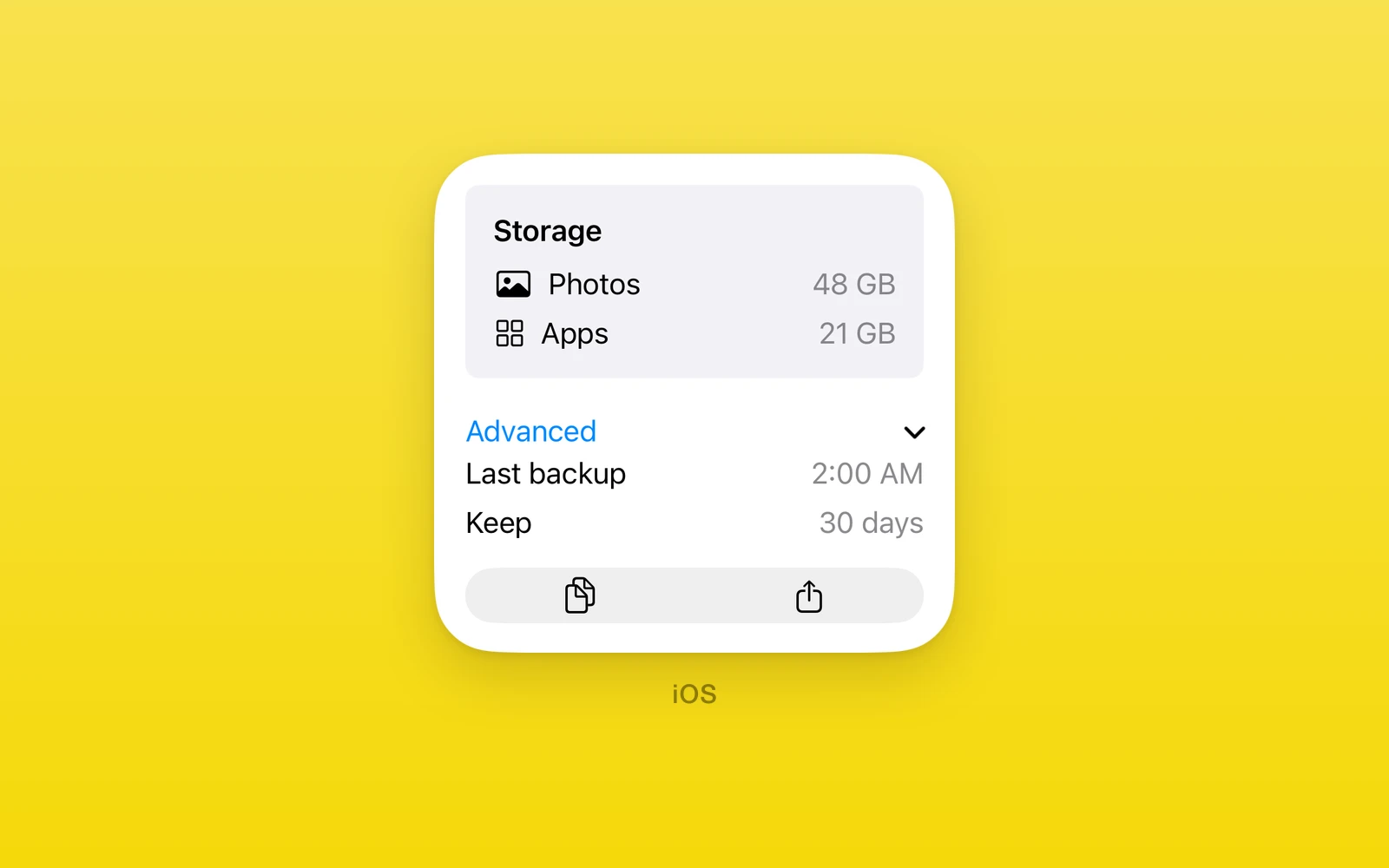
Grouping, disclosure, glass, and modifier slot views under One.iOS.
GroupBox,DisclosureGroup, andControlGroupgroup related rows and controls.ViewThatFitspicks the first child that fits.GlassandGlassEffectContainerapply Liquid Glass on iOS 26 and later.Overlay,ViewSlot, andSwipeActionsattach native content to a view.- Every view here throws on web and Android.
Group
One.iOS.Group groups children with no visual effect. Use it to apply
modifiers or structure to several views at once.
| Props | Type | Description |
|---|---|---|
children (required)ReactNodeThe grouped views. | ReactNode | The grouped views. |
GroupBox
One.iOS.GroupBox draws SwiftUI’s standard group box around its native
children. label is optional; omit it for the unlabeled SwiftUI initializer.
The box measures its content and stretches to its parent’s width.
| Props | Type | Description |
|---|---|---|
labelstringThe title. Omit it for an unlabeled box. | string | The title. Omit it for an unlabeled box. |
childrenReactNodeThe boxed content. | ReactNode | The boxed content. |
<One.iOS.GroupBox label="Account"> <One.iOS.Text text="Signed in" /></One.iOS.GroupBox>ViewThatFits
One.iOS.ViewThatFits uses SwiftUI’s first child that fits the proposed size.
It requires iOS 16 or newer. Children stay in preference order. axes is
'horizontal', 'vertical', or 'both' (the SwiftUI default); it controls
which dimensions SwiftUI tests for fit. If none fits, SwiftUI shows the last
child.
Give the view a style.height when vertical fit should use a finite height
proposal. Without it, the container measures its chosen child and the vertical
proposal is unbounded.
| Props | Type | Description |
|---|---|---|
axesViewThatFitsAxes = "both"horizontal, vertical, or both: the dimensions tested for fit. | ViewThatFitsAxes = "both" | horizontal, vertical, or both: the dimensions tested for fit. |
children (required)ReactNodeCandidates, most preferred first. | ReactNode | Candidates, most preferred first. |
<One.iOS.ViewThatFits axes="horizontal"> <One.iOS.Button label="Detailed action" onPress={run} /> <One.iOS.Button label="Action" onPress={run} /></One.iOS.ViewThatFits>ControlGroup
One.iOS.ControlGroup groups controls into one segmented unit with an
optional label and systemImage. controlGroupStyle is 'palette',
'automatic', 'navigation', 'menu', or 'compactMenu'.
Standalone, it reports the native control height to React Native so following
rows sit below it. Inside a One.iOS.Host, the parent measures it as SwiftUI
content. An explicit style.height keeps the requested React Native height.
The iOS 27 conformance fixture verifies both native buttons, Host composition,
and a fixed-height group.
| Props | Type | Description |
|---|---|---|
labelstring = ""The group title. | string = "" | The group title. |
systemImagestring = ""An SF Symbol for the title. | string = "" | An SF Symbol for the title. |
controlGroupStyleControlGroupStyle = "automatic"automatic, palette, navigation, menu, or compactMenu. | ControlGroupStyle = "automatic" | automatic, palette, navigation, menu, or compactMenu. |
children (required)ReactNodeThe controls. | ReactNode | The controls. |
DisclosureGroup
One.iOS.DisclosureGroup is an expanding section. label is required;
isExpanded with onIsExpandedChange (and revision for external
resets) controls the expansion. A standalone group reports its intrinsic
SwiftUI height to React Native as its content opens and closes, so following
React Native siblings move with it. It also composes inside One.iOS.Host or
One.iOS.ZStack or One.iOS.ViewThatFits, where the parent measures the
expanded content. An explicit style.height keeps that React Native height
while the native content expands within its box.
| Props | Type | Description |
|---|---|---|
label (required)stringThe row title. | string | The row title. |
isExpanded (required)booleanWhether the content shows. | boolean | Whether the content shows. |
onIsExpandedChange (required)(isExpanded: boolean) => voidA native tap, with the new state. | (isExpanded: boolean) => void | A native tap, with the new state. |
revisionnumber = 0Increase with a new isExpanded to reset it from outside. | number = 0 | Increase with a new isExpanded to reset it from outside. |
children (required)ReactNodeThe content shown when expanded. | ReactNode | The content shown when expanded. |
import { One } from 'one'
<One.iOS.DisclosureGroup  label="Advanced"  isExpanded={open}  onIsExpandedChange={setOpen}>  <One.iOS.Toggle label="Debug" isOn={debug} onIsOnChange={setDebug} /></One.iOS.DisclosureGroup>
The iOS 27 conformance fixture verifies native taps, external React resets, explicit height, and the collapsed and expanded frames of standalone and composed groups.
Divider
One.iOS.Divider draws a hairline between rows. It takes view props only.
Link
One.iOS.Link opens destination, a URL string, with an optional label
or children.
| Props | Type | Description |
|---|---|---|
destination (required)stringThe URL to open. | string | The URL to open. |
labelstringThe link text. | string | The link text. |
childrenReactNodeCustom content in place of label. | ReactNode | Custom content in place of label. |
LabeledContent
One.iOS.LabeledContent shows a label with a value string, an optional
systemImage, and optional children for a custom value view. Pass either
value or children. Updating value from React updates the SwiftUI row.
| Props | Type | Description |
|---|---|---|
label (required)stringThe row title. | string | The row title. |
valuestringThe trailing value. | string | The trailing value. |
systemImagestringAn SF Symbol before the title. | string | An SF Symbol before the title. |
childrenReactNodeA custom value view in place of value. | ReactNode | A custom value view in place of value. |
Glass
One.iOS.Glass applies a glass or material effect to its children.
glassEffect is 'regular', 'clear', or 'identity'; material picks
the SwiftUI material; shape picks the glass shape; cornerRadius
explicitly rounds; interactive opts into interactive glass; tint and
colorScheme tint and scope the effect. Give a standalone Glass a height or
a flex parent: the surface fills the box it receives. Glass effects require
iOS 26 or newer; identity removes the glass while keeping the children.
| Props | Type | Description |
|---|---|---|
glassEffectGlassEffectregular, clear, or identity. | GlassEffect | regular, clear, or identity. |
materialMaterialultraThin, thin, regular, thick, or ultraThick. | Material | ultraThin, thin, regular, thick, or ultraThick. |
shapeGlassEffectShapecapsule, circle, containerRelativeShape, ellipse, rectangle, or roundedRectangle. | GlassEffectShape | capsule, circle, containerRelativeShape, ellipse, rectangle, or roundedRectangle. |
cornerRadiusnumberRounds the shape explicitly. | number | Rounds the shape explicitly. |
interactiveboolean = falseReacts to touches. | boolean = false | Reacts to touches. |
tintColorValueTints the glass. | ColorValue | Tints the glass. |
colorSchemeColorSchemelight or dark for the effect. | ColorScheme | light or dark for the effect. |
children (required)ReactNodeThe content on the glass. | ReactNode | The content on the glass. |
GlassEffectContainer
One.iOS.GlassEffectContainer requires iOS 26 or newer. It groups nearby
SwiftUI glass effects so the system can merge them. spacing is an optional,
finite number in points; omit it to keep SwiftUI’s own default spacing.
| Props | Type | Description |
|---|---|---|
spacingnumberHow close glass shapes must be to merge. | number | How close glass shapes must be to merge. |
children (required)ReactNodeViews with glass effects. | ReactNode | Views with glass effects. |
<One.iOS.GlassEffectContainer spacing={12}> <One.iOS.HStack spacing={8}> <One.iOS.Button label="Add" onPress={add} swiftStyle={{ glassEffect: 'regular' }} /> <One.iOS.Button label="Filter" onPress={filter} swiftStyle={{ glassEffect: 'regular' }} /> </One.iOS.HStack></One.iOS.GlassEffectContainer>Overlay, Overlay.Content
One.iOS.Overlay layers its children over the views behind it with an
alignment from the ZStack alignments. One.iOS.Overlay.Content marks the
overlay subtree. Native controls in that subtree can call their React
handlers. Alignment uses the base view’s SwiftUI frame. For a full-size
bottomTrailing overlay, give the base a native swiftStyle.frameWithWidthAndHeightAndAlignment
frame; a React Native style on the outer host alone does not enlarge an
intrinsic Text base. The iOS 27 fixture verifies the bottom-trailing frame
and the overlay button tap.
| Props | Type | Description |
|---|---|---|
alignmentZStackAlignmentWhere the overlay sits on the base view. | ZStackAlignment | Where the overlay sits on the base view. |
children (required)ReactNodeThe base view and one Overlay.Content. | ReactNode | The base view and one Overlay.Content. |
ViewSlot, ViewSlot.Content
One.iOS.ViewSlot hosts a native view modifier slot: name picks the
SwiftUI slot (background, alert, accessibility actions, and the rest) and
options carries that slot’s parameters. One.iOS.ViewSlot.Content marks
the slot subtree. The slot content can contain interactive native controls:
<One.iOS.ViewSlot name="safeAreaInsetWithVerticalEdge" options={{ edge: 'bottom' }}> <One.iOS.Text text="Content" /> <One.iOS.ViewSlot.Content> <One.iOS.Button label="Continue" onPress={continueFlow} /> </One.iOS.ViewSlot.Content></One.iOS.ViewSlot>For a side inset, use name="safeAreaInsetWithHorizontalEdge" with
options={{ edge: 'leading' }} or options={{ edge: 'trailing' }}. On an iOS 27
iPhone, the inset content appeared on the requested side of the base view and
native button taps reached React. The fixture used bounded 280 × 180 point
hosts; scroll content and other container sizes remain unproven.
On iOS 26 or newer, safeAreaBarWithVerticalEdge accepts
options={{ edge: 'top' }} or options={{ edge: 'bottom' }}. Put the bar’s native controls in
ViewSlot.Content. In the iOS 27 fixture, the top bar action appears above its
base view and the bottom bar action appears below its base view; both actions
reach React.
safeAreaBarWithHorizontalEdge accepts options={{ edge: 'leading' }} or
options={{ edge: 'trailing' }} on iOS 26 or newer. In the bounded iOS 27
fixture, the native bar action is edge-adjacent to its base view on the chosen
side; both actions reach React. Other host sizes and scroll content are
unproven.
The iOS 27 conformance fixtures also exercise background paint, a mask
that clips a colored rectangle to a circle, listRowBackground behind a
List row, and an interactive safeAreaInsetWithVerticalEdge with
edge: 'bottom', plus leading and trailing horizontal safe-area insets in
bounded hosts. Other slot names have not yet been checked on a simulator.
SwipeActions, SwipeActions.Actions
One.iOS.SwipeActions wraps a List row to add swipe actions.
One.iOS.SwipeActions.Actions groups the action buttons with edge
('leading' or 'trailing') and allowsFullSwipe.
| SwipeActions.Actions | Type | Description |
|---|---|---|
edgeSwipeActionsEdge = "trailing"leading or trailing. | SwipeActionsEdge = "trailing" | leading or trailing. |
allowsFullSwipeboolean = trueA full swipe runs the first action. | boolean = true | A full swipe runs the first action. |
children (required)ReactNodeThe action buttons. | ReactNode | The action buttons. |
<One.iOS.List> <One.iOS.SwipeActions> <One.iOS.Text text="Message" /> <One.iOS.SwipeActions.Actions edge="leading" allowsFullSwipe={false}> <One.iOS.Button label="Pin" onPress={pinMessage} /> </One.iOS.SwipeActions.Actions> <One.iOS.SwipeActions.Actions edge="trailing"> <One.iOS.Button label="Archive" onPress={archiveMessage} /> </One.iOS.SwipeActions.Actions> </One.iOS.SwipeActions></One.iOS.List>On iOS 27, the conformance fixture shows that a full trailing swipe invokes
Archive by default. With allowsFullSwipe={false}, a full leading swipe
reveals Pin without invoking it; the revealed button remains tappable.
Edit this page on GitHub.