
iOS Pickers
Picker, DatePicker, ColorPicker, PhotosPicker, and FileImporter under One.iOS
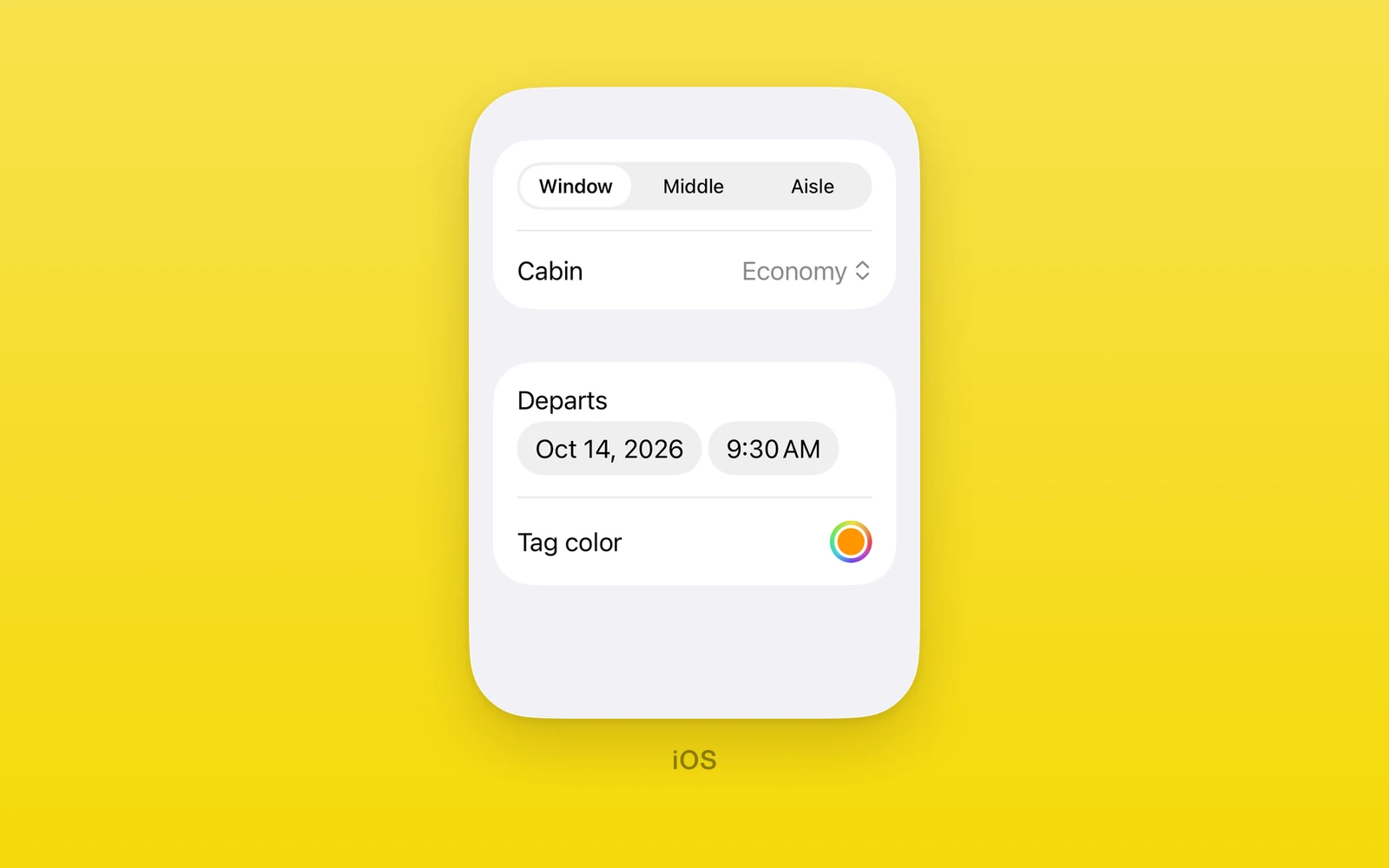
Value pickers and system choosers under One.iOS, drawn by SwiftUI.
Picker,DatePicker, andColorPickerare controlled: aselection, anonSelectionChangecallback, and arevisionfor external resets.PhotosPickerandFileImporteropen the system photo library and file browser.- Invalid values throw during render.
- Every picker throws on web and Android. Keep them in an iOS branch or an
.ios.tsxfile.
Usage
import { useState } from 'react'import { One } from 'one'
export function TripForm() {  const [seat, setSeat] = useState('window')  const [date, setDate] = useState(() => new Date())
  return (    <One.iOS.Form style={{ flex: 1 }}>      <One.iOS.Section>        <One.iOS.Picker          label="Seat"          selection={seat}          onSelectionChange={setSeat}          pickerStyle="segmented"          options={[            { value: 'window', label: 'Window' },            { value: 'aisle', label: 'Aisle' },          ]}        />        <One.iOS.DatePicker          label="Departure"          selection={date}          onSelectionChange={setDate}          minimumDate={new Date()}        />      </One.iOS.Section>    </One.iOS.Form>  )}
Shared props
Every picker also accepts accessibilityLabel, accessibilityHint,
accessibilityValue, testID, style, onLayout, and swiftStyle.
Picker
One.iOS.Picker picks one string from options.
| Props | Type | Description |
|---|---|---|
selection (required)stringThe selected option value. | string | The selected option value. |
onSelectionChange (required)(value: string) => voidA native pick, with the new value. | (value: string) => void | A native pick, with the new value. |
options (required)readonly PickerOption[]Each { value, label }, in order. | readonly PickerOption[] | Each { value, label }, in order. |
revisionnumber = 0Increase with a new selection to reset it from outside. | number = 0 | Increase with a new selection to reset it from outside. |
labelstring = ""The row title. | string = "" | The row title. |
pickerStylePickerStyle = "automatic"automatic, menu, segmented, inline, wheel, palette, tabs, or navigationLink. | PickerStyle = "automatic" | automatic, menu, segmented, inline, wheel, palette, tabs, or navigationLink. |
disabledboolean = falseDims the picker and ignores taps. | boolean = false | Dims the picker and ignores taps. |
On an iOS 27 iPhone, palette outside a native Menu shows as a segmented
picker. navigationLink needs a native navigation context and throws without
one.
DatePicker
One.iOS.DatePicker picks a Date.
| Props | Type | Description |
|---|---|---|
selection (required)DateThe selected date. | Date | The selected date. |
onSelectionChange (required)(value: Date) => voidA native pick, with the new date. | (value: Date) => void | A native pick, with the new date. |
revisionnumber = 0Increase with a new selection to reset it from outside. | number = 0 | Increase with a new selection to reset it from outside. |
labelstring = ""The row title. | string = "" | The row title. |
minimumDateDateThe earliest date. Unbounded when unset. | Date | The earliest date. Unbounded when unset. |
maximumDateDateThe latest date. Unbounded when unset. | Date | The latest date. Unbounded when unset. |
displayedComponents"date" | "hourAndMinute" | "dateAndTime" = "dateAndTime"Which parts people pick. | "date" | "hourAndMinute" | "dateAndTime" = "dateAndTime" | Which parts people pick. |
datePickerStyleDatePickerStyle = "automatic"automatic, compact, graphical, or wheel. | DatePickerStyle = "automatic" | automatic, compact, graphical, or wheel. |
disabledboolean = falseDims the picker and ignores taps. | boolean = false | Dims the picker and ignores taps. |
The selection must lie within the bounds, and minimumDate must not be after
maximumDate, or the picker throws.
ColorPicker
One.iOS.ColorPicker picks a color as a hex string.
| Props | Type | Description |
|---|---|---|
selection (required)string#RRGGBB or #RRGGBBAA. Anything else throws. | string | #RRGGBB or #RRGGBBAA. Anything else throws. |
onSelectionChange (required)(value: string) => voidA native pick, with the new color. | (value: string) => void | A native pick, with the new color. |
revisionnumber = 0Increase with a new selection to reset it from outside. | number = 0 | Increase with a new selection to reset it from outside. |
labelstring = ""The row title. | string = "" | The row title. |
supportsOpacityboolean = trueShows the opacity slider. | boolean = true | Shows the opacity slider. |
disabledboolean = falseDims the picker and ignores taps. | boolean = false | Dims the picker and ignores taps. |
PhotosPicker
One.iOS.PhotosPicker is a button that opens the system photo library.
<One.iOS.PhotosPicker label="Add photos" onPick={(url) => addPhoto(url)} onPickError={(message) => setError(message)} maxSelectionCount={5} filter="images"/>| Props | Type | Description |
|---|---|---|
labelstringThe button title. Required at runtime; an empty label throws. | string | The button title. Required at runtime; an empty label throws. |
systemImagestring = ""An SF Symbol shown with the title. | string = "" | An SF Symbol shown with the title. |
onPick(url: string, index: number, count: number) => voidOnce per picked asset, with a local file URL. | (url: string, index: number, count: number) => void | Once per picked asset, with a local file URL. |
onPickItemIdentifier(itemIdentifier: string, index: number, count: number) => voidOnce per picked asset, with its Photos identifier. | (itemIdentifier: string, index: number, count: number) => void | Once per picked asset, with its Photos identifier. |
onPickError(message: string) => voidAn asset failed to load. | (message: string) => void | An asset failed to load. |
maxSelectionCountnumber = 1How many assets people may pick. | number = 1 | How many assets people may pick. |
selectionBehaviorPhotosPickerSelectionBehavior = "default"default, ordered, continuous, or continuousAndOrdered. | PhotosPickerSelectionBehavior = "default" | default, ordered, continuous, or continuousAndOrdered. |
filter"any" | "images" | "videos" | "livePhotos" | "screenshots" | "screenRecordings" | "slomoVideos" | "timelapseVideos" | "cinematicVideos" | "depthEffectPhotos" | "bursts" | "panoramas" = "any"Which assets the library shows. | "any" | "images" | "videos" | "livePhotos" | "screenshots" | "screenRecordings" | "slomoVideos" | "timelapseVideos" | "cinematicVideos" | "depthEffectPhotos" | "bursts" | "panoramas" = "any" | Which assets the library shows. |
preferredItemEncodingEncodingDisambiguationPolicy = "automatic"automatic, current, or compatible file encoding. | EncodingDisambiguationPolicy = "automatic" | automatic, current, or compatible file encoding. |
disabledboolean = falseDims the button and ignores taps. | boolean = false | Dims the button and ignores taps. |
FileImporter
One.iOS.FileImporter presents the system file browser while isPresented
is true.
| Props | Type | Description |
|---|---|---|
isPresented (required)booleanWhether the browser is shown. | boolean | Whether the browser is shown. |
onIsPresentedChange (required)(value: boolean) => voidThe browser closed. | (value: boolean) => void | The browser closed. |
revisionnumberIncrease with a new isPresented to reset it from outside. | number | Increase with a new isPresented to reset it from outside. |
onCompletion(completion: FileImporterCompletion) => voidOnce per file, or once on failure or cancel. | (completion: FileImporterCompletion) => void | Once per file, or once on failure or cancel. |
allowedContentTypesreadonly string[]Uniform type identifiers people may pick. | readonly string[] | Uniform type identifiers people may pick. |
allowsMultipleSelectionbooleanAllows more than one file. | boolean | Allows more than one file. |
A completion is { type: 'success', url, index, count },
{ type: 'failed', message }, or { type: 'cancelled' }.
Edit this page on GitHub.