wwwwwwwwwwwwwwwwwww
iOS Text and Fields
Text, Label, TextField, SecureField, and TextEditor under One.iOS
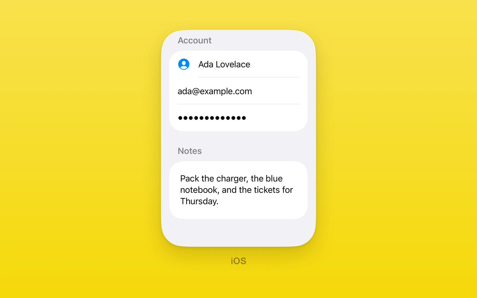
Text display and text entry under One.iOS, drawn by SwiftUI.
TextField,SecureField, andTextEditortake a string or aNativeStatehandle, so typing stays correct without a React render.- Focus is controlled with
focused,onFocusChange, andfocusRevision. - Keyboard, autocapitalization, and AutoFill hints map to UIKit.
- These views throw outside iOS. For a field that also runs on Android and web, use One.UI.TextInput.
Usage
import { One, useNativeState } from 'one'
export function SignIn() {  const email = useNativeState('')  const password = useNativeState('')
  return (    <One.iOS.Form style={{ flex: 1 }}>      <One.iOS.Section>        <One.iOS.TextField          label="Email"          prompt="you@example.com"          text={email}          onTextChange={(value) => email.set(value)}          keyboardType="emailAddress"          textContentType="username"          textInputAutocapitalization="never"          submitLabel="next"        />        <One.iOS.SecureField          label="Password"          prompt="Password"          text={password}          onTextChange={(value) => password.set(value)}          textContentType="password"          submitLabel="go"          onSubmit={signIn}        />      </One.iOS.Section>    </One.iOS.Form>  )}
Every view on this page also accepts accessibilityLabel,
accessibilityHint, accessibilityValue, testID, style, onLayout, and
swiftStyle.
TextField
One.iOS.TextField is a single line field, or a growing multi-line field with
axis="vertical".
| Props | Type | Description |
|---|---|---|
text (required)string | NativeState<string>The text. A NativeState handle from useNativeState keeps keystrokes off the React render. | string | NativeState<string> | The text. A NativeState handle from useNativeState keeps keystrokes off the React render. |
onTextChange (required)(value: string) => voidA native edit, with the new text. | (value: string) => void | A native edit, with the new text. |
revisionnumber = 0Increase with a new text to reset it from outside. | number = 0 | Increase with a new text to reset it from outside. |
focusedbooleanWhether the field has focus. Controlled like text. | boolean | Whether the field has focus. Controlled like text. |
onFocusChange(focused: boolean) => voidFocus moved in or out. | (focused: boolean) => void | Focus moved in or out. |
focusRevisionnumber = 0Increase with a new focused to apply it from outside. | number = 0 | Increase with a new focused to apply it from outside. |
onSubmit() => voidReturn was pressed. | () => void | Return was pressed. |
labelstring = ""The accessibility label. | string = "" | The accessibility label. |
promptstring = ""The placeholder. | string = "" | The placeholder. |
textFieldStyleTextFieldStyle = "automatic"automatic, roundedBorder, bordered, or plain. | TextFieldStyle = "automatic" | automatic, roundedBorder, bordered, or plain. |
submitLabelSubmitLabel | "" = ""The return key title: done, go, send, join, route, search, return, next, or continue. | SubmitLabel | "" = "" | The return key title: done, go, send, join, route, search, return, next, or continue. |
textInputAutocapitalizationTextInputAutocapitalization | "" = ""never, words, sentences, or characters. | TextInputAutocapitalization | "" = "" | never, words, sentences, or characters. |
autocorrectionDisabledboolean = falseTurns autocorrection off. | boolean = false | Turns autocorrection off. |
keyboardTypeKeyboardType | "" = ""The keyboard, such as emailAddress or numberPad. | KeyboardType | "" = "" | The keyboard, such as emailAddress or numberPad. |
textContentTypeTextContentType | "" = ""The content hint for AutoFill, such as username or oneTimeCode. | TextContentType | "" = "" | The content hint for AutoFill, such as username or oneTimeCode. |
disabledboolean = falseDims the field and blocks editing. | boolean = false | Dims the field and blocks editing. |
axisAxis = "horizontal"vertical grows the field to more lines as text wraps. | Axis = "horizontal" | vertical grows the field to more lines as text wraps. |
SecureField
One.iOS.SecureField obscures its input for passwords. It has the same props
as TextField except axis.
| Props | Type | Description |
|---|---|---|
text (required)string | NativeState<string>The text. A NativeState handle from useNativeState keeps keystrokes off the React render. | string | NativeState<string> | The text. A NativeState handle from useNativeState keeps keystrokes off the React render. |
onTextChange (required)(value: string) => voidA native edit, with the new text. | (value: string) => void | A native edit, with the new text. |
revisionnumber = 0Increase with a new text to reset it from outside. | number = 0 | Increase with a new text to reset it from outside. |
focusedbooleanWhether the field has focus. Controlled like text. | boolean | Whether the field has focus. Controlled like text. |
onFocusChange(focused: boolean) => voidFocus moved in or out. | (focused: boolean) => void | Focus moved in or out. |
focusRevisionnumber = 0Increase with a new focused to apply it from outside. | number = 0 | Increase with a new focused to apply it from outside. |
onSubmit() => voidReturn was pressed. | () => void | Return was pressed. |
labelstring = ""The accessibility label. | string = "" | The accessibility label. |
promptstring = ""The placeholder. | string = "" | The placeholder. |
textFieldStyleTextFieldStyle = "automatic"automatic, roundedBorder, bordered, or plain. | TextFieldStyle = "automatic" | automatic, roundedBorder, bordered, or plain. |
submitLabelSubmitLabel | "" = ""The return key title: done, go, send, join, route, search, return, next, or continue. | SubmitLabel | "" = "" | The return key title: done, go, send, join, route, search, return, next, or continue. |
textInputAutocapitalizationTextInputAutocapitalization | "" = ""never, words, sentences, or characters. | TextInputAutocapitalization | "" = "" | never, words, sentences, or characters. |
autocorrectionDisabledboolean = falseTurns autocorrection off. | boolean = false | Turns autocorrection off. |
keyboardTypeKeyboardType | "" = ""The keyboard, such as emailAddress or numberPad. | KeyboardType | "" = "" | The keyboard, such as emailAddress or numberPad. |
textContentTypeTextContentType | "" = ""The content hint for AutoFill, such as username or oneTimeCode. | TextContentType | "" = "" | The content hint for AutoFill, such as username or oneTimeCode. |
disabledboolean = falseDims the field and blocks editing. | boolean = false | Dims the field and blocks editing. |
TextEditor
One.iOS.TextEditor is SwiftUI’s multi-line editor. Return inserts a newline,
and the editor scrolls its text inside its box, so give it a height. SwiftUI’s
editor has no label, placeholder, style, or submit; name it with
accessibilityLabel.
<One.iOS.TextEditor text={notes} onTextChange={setNotes} accessibilityLabel="Notes" style={{ height: 160 }}/>| Props | Type | Description |
|---|---|---|
text (required)string | NativeState<string>The text. A NativeState handle from useNativeState keeps keystrokes off the React render. | string | NativeState<string> | The text. A NativeState handle from useNativeState keeps keystrokes off the React render. |
onTextChange (required)(value: string) => voidA native edit, with the new text. | (value: string) => void | A native edit, with the new text. |
revisionnumber = 0Increase with a new text to reset it from outside. | number = 0 | Increase with a new text to reset it from outside. |
focusedbooleanWhether the field has focus. Controlled like text. | boolean | Whether the field has focus. Controlled like text. |
onFocusChange(focused: boolean) => voidFocus moved in or out. | (focused: boolean) => void | Focus moved in or out. |
focusRevisionnumber = 0Increase with a new focused to apply it from outside. | number = 0 | Increase with a new focused to apply it from outside. |
textInputAutocapitalizationTextInputAutocapitalization | "" = ""never, words, sentences, or characters. | TextInputAutocapitalization | "" = "" | never, words, sentences, or characters. |
autocorrectionDisabledboolean = falseTurns autocorrection off. | boolean = false | Turns autocorrection off. |
keyboardTypeKeyboardType | "" = ""The keyboard, such as emailAddress or numberPad. | KeyboardType | "" = "" | The keyboard, such as emailAddress or numberPad. |
textContentTypeTextContentType | "" = ""The content hint for AutoFill, such as username or oneTimeCode. | TextContentType | "" = "" | The content hint for AutoFill, such as username or oneTimeCode. |
disabledboolean = falseDims the field and blocks editing. | boolean = false | Dims the field and blocks editing. |
Text
One.iOS.Text renders one string.
| Props | Type | Description |
|---|---|---|
textstringThe string to show. | string | The string to show. |
Label
One.iOS.Label renders a title with an SF Symbol.
<One.iOS.Label label="Favorites" systemImage="star" />| Props | Type | Description |
|---|---|---|
labelstringThe title. | string | The title. |
systemImagestringAn SF Symbol before the title. | string | An SF Symbol before the title. |
disabledbooleanDims the label. | boolean | Dims the label. |
Edit this page on GitHub.