iOS Stacks
Host, HStack, VStack, ZStack, Spacer, and Slot under One.iOS
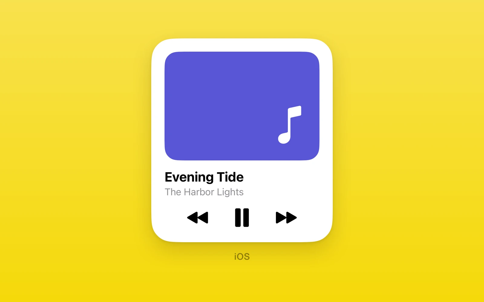
SwiftUI stack layout under One.iOS.
HStack,VStack, andZStackmeasure their SwiftUI children, so controls inside them are sized by SwiftUI.Hostcarries React Native children into a SwiftUI container.- Environment props set color scheme, type size, control size, locale, tint, and enabled state for a whole subtree.
- Every view here throws on web and Android.
Usage
import { One } from 'one'
<One.iOS.VStack spacing={8} style={{ width: '100%' }}>  <One.iOS.HStack>    <One.iOS.Label label="Wi-Fi" systemImage="wifi" />    <One.iOS.Spacer />    <One.iOS.Text text="Home" />  </One.iOS.HStack>  <One.iOS.ProgressView value={0.4} /></One.iOS.VStack>
Greedy containers take the box they are given instead of reporting an ideal
height, so they cannot be children of a stack: Form, List, ScrollView,
Tabs, Pager, and NavigationStack each need their own box.
Host, HStack, VStack
One.iOS.Host lays children along axis. One.iOS.HStack is always
horizontal and One.iOS.VStack always vertical; both take the same props
without axis. Children that are not SwiftUI views render through React
Native inside the stack.
| Props | Type | Description |
|---|---|---|
axisHostAxis = "vertical"vertical or horizontal. Host only. | HostAxis = "vertical" | vertical or horizontal. Host only. |
spacingnumber = 0The gap between children. Must be zero or more. | number = 0 | The gap between children. Must be zero or more. |
alignmentHostAlignment = "leading"leading, center, or trailing. | HostAlignment = "leading" | leading, center, or trailing. |
children (required)ReactNodeSwiftUI views or React Native views. | ReactNode | SwiftUI views or React Native views. |
Environment
Host, HStack, VStack, and Form apply these to their whole subtree.
| Environment | Type | Description |
|---|---|---|
colorSchemeColorSchemelight or dark. | ColorScheme | light or dark. |
dynamicTypeSizeDynamicTypeSizexSmall through xxxLarge, or accessibility1 through accessibility5. | DynamicTypeSize | xSmall through xxxLarge, or accessibility1 through accessibility5. |
controlSizeControlSizemini, small, regular, large, or extraLarge. | ControlSize | mini, small, regular, large, or extraLarge. |
localestringA non-empty locale identifier, such as fr_FR. | string | A non-empty locale identifier, such as fr_FR. |
tintColorValueThe accent color for controls. | ColorValue | The accent color for controls. |
isEnabledbooleanfalse disables every control inside. | boolean | false disables every control inside. |
On an iOS 27 simulator, a bordered prominent Button inside
Host controlSize grew when the value changed from mini to extraLarge
and returned to its original height when restored.
ZStack
One.iOS.ZStack layers children and takes the size of the largest one.
alignment places the smaller children within it.
| Props | Type | Description |
|---|---|---|
alignmentZStackAlignment = "center"topLeading, top, topTrailing, leading, center, trailing, bottomLeading, bottom, or bottomTrailing. | ZStackAlignment = "center" | topLeading, top, topTrailing, leading, center, trailing, bottomLeading, bottom, or bottomTrailing. |
children (required)ReactNodeThe layers, back to front. | ReactNode | The layers, back to front. |
Spacer
One.iOS.Spacer expands along its stack’s axis and pushes its neighbors
apart. It must be inside a stack or another native container.
| Props | Type | Description |
|---|---|---|
minLengthnumber = 0The least space it leaves. Must be zero or more. | number = 0 | The least space it leaves. Must be zero or more. |
Slot
One.iOS.Slot reserves a fixed box inside a native container, for React
Native content a measured parent cannot size.
| Props | Type | Description |
|---|---|---|
height (required)numberThe box height. Must be above zero. | number | The box height. Must be above zero. |
widthnumber = 0The box width. 0 fills the width offered; inside an HStack, set one. | number = 0 | The box width. 0 fills the width offered; inside an HStack, set one. |
children (required)ReactNodeThe React Native content. | ReactNode | The React Native content. |
Edit this page on GitHub.