wwwwwwwwwwwwwwwwwww
iOS Progress and Gauges
ProgressView and Gauge under One.iOS
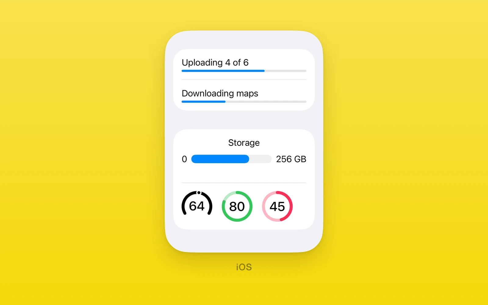
Progress and measurement views under One.iOS, drawn by SwiftUI.
ProgressViewshows a determinate bar or an indeterminate spinner.Gaugeshows a value in a range, with optional labels.- Out-of-range values throw during render.
- Both throw on web and Android. Keep them in an iOS branch or an
.ios.tsxfile.
Usage
import { One } from 'one'
<One.iOS.ProgressView label="Download" value={downloaded} total={size} /><One.iOS.ProgressView label="Loading" /><One.iOS.Gauge  label="Speed"  value={speed}  maximumValue={120}  currentValueLabel={`${speed}`}  gaugeStyle="accessoryCircular"/>
Both also accept accessibilityLabel, accessibilityHint,
accessibilityValue, testID, style, onLayout, and swiftStyle.
ProgressView
| Props | Type | Description |
|---|---|---|
valuenumberWork done. Leave it unset for a spinner. | number | Work done. Leave it unset for a spinner. |
totalnumber = 1Work in all. Must be above zero. | number = 1 | Work in all. Must be above zero. |
labelstring = ""Text shown with the bar. | string = "" | Text shown with the bar. |
progressViewStyleProgressViewStyle = "automatic"automatic, linear, or circular. | ProgressViewStyle = "automatic" | automatic, linear, or circular. |
disabledboolean = falseDims the view. | boolean = false | Dims the view. |
value must lie between 0 and total, or the view throws.
Gauge
| Props | Type | Description |
|---|---|---|
valuenumber = 0The current value. | number = 0 | The current value. |
minimumValuenumber = 0The low end of the range. | number = 0 | The low end of the range. |
maximumValuenumber = 1The high end of the range. | number = 1 | The high end of the range. |
labelstring = ""What the gauge measures. | string = "" | What the gauge measures. |
currentValueLabelstring = ""Text for the current value. | string = "" | Text for the current value. |
minimumValueLabelstring = ""Text at the low end. | string = "" | Text at the low end. |
maximumValueLabelstring = ""Text at the high end. | string = "" | Text at the high end. |
gaugeStyleGaugeStyle = "automatic"automatic, linearCapacity, accessoryLinear, accessoryLinearCapacity, accessoryCircular, or accessoryCircularCapacity. | GaugeStyle = "automatic" | automatic, linearCapacity, accessoryLinear, accessoryLinearCapacity, accessoryCircular, or accessoryCircularCapacity. |
disabledboolean = falseDims the gauge. | boolean = false | Dims the gauge. |
The value must lie within the range, and the minimum must be below the maximum, or the gauge throws.
Edit this page on GitHub.