wwwwwwwwwwwwwwwwwww
Android Menus
Menu and ContextMenu under One.Android
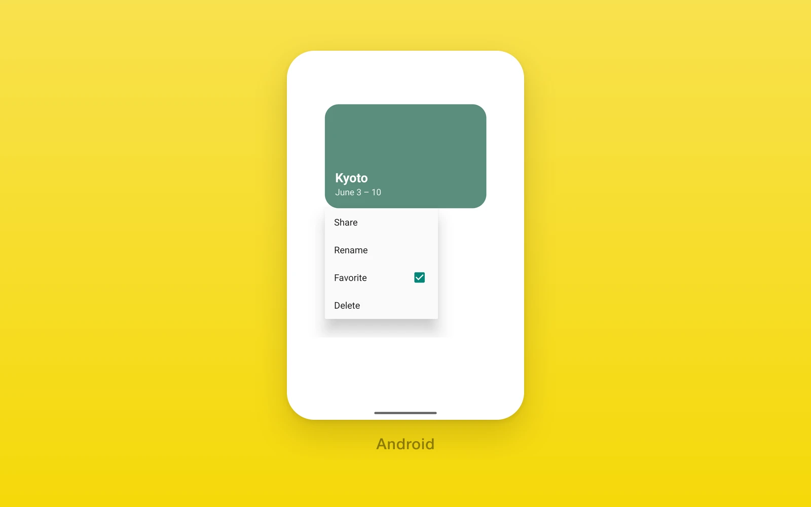
One.Android.Menu opens on tap and One.Android.ContextMenu opens on long
press. Both show the platform popup, anchored to the trigger. They take
the same props and items as the iOS menu (see
Presentations and Menus), with the
differences below.
import { One } from 'one'
<One.Android.Menu accessibilityLabel="Options" items={[ { type: 'action', id: 'share', title: 'Share' }, { type: 'toggle', id: 'pin', title: 'Pin', values: [pinned] }, { type: 'action', id: 'delete', title: 'Delete' }, ]} onAction={(id) => act(id)} onValueChange={(id, value) => setPinned(value)}> <One.Android.Icon name="more_vert" /></One.Android.Menu>| Props | Type | Description |
|---|---|---|
items (required)readonly MenuItem[]The menu content. Picker items throw. | readonly MenuItem[] | The menu content. Picker items throw. |
onAction (required)(id: string) => voidA tapped action item. | (id: string) => void | A tapped action item. |
onValueChange(id: string, value: boolean, sourceIndex: number) => voidA tapped toggle item. Required when items has toggles. | (id: string, value: boolean, sourceIndex: number) => void | A tapped toggle item. Required when items has toggles. |
accessibilityLabel (required)stringNames the trigger. | string | Names the trigger. |
disabledboolean = falseBlocks the tap and the long press. | boolean = false | Blocks the tap and the long press. |
children (required)ReactNodeThe trigger. | ReactNode | The trigger. |
primaryAction() => voidIgnored on Android. | () => void | Ignored on Android. |
onPickerChange(id: string, value: string) => voidIgnored on Android. | (id: string, value: string) => void | Ignored on Android. |
revisionnumber = 0Ignored on Android. | number = 0 | Ignored on Android. |
menuOrderMenuOrder = "automatic"Ignored on Android. | MenuOrder = "automatic" | Ignored on Android. |
menuActionDismissBehaviorMenuActionDismissBehavior = "automatic"Ignored on Android. A tap always closes the menu. | MenuActionDismissBehavior = "automatic" | Ignored on Android. A tap always closes the menu. |
ContextMenu takes the same props without primaryAction, and its
accessibilityLabel is optional because the trigger keeps its own.
The popup draws titles only, so systemImage, role, and help have no
effect. Items map like this:
type | On Android |
|---|---|
'action' | A row. disabled grays it, hidden leaves it out. |
'toggle' | A checkable row per value; several values add a number to each title. |
'submenu' | A row that opens a nested popup. |
'section' | Also a nested popup, titled by the section. |
'controlGroup' | Its children inline. |
'divider' | Nothing. |
'picker' | Throws. |
Item ids must be unique and nonempty. The menu reads the trigger’s native view when it opens, and throws if there is none.
These components throw when rendered outside an Android build, so keep those branches behind platform checks.
Edit this page on GitHub.