iOS Buttons and Toggles
Button, PasteButton, Toggle, Slider, Stepper, ShareLink, SignInWithAppleButton, and EditButton under One.iOS
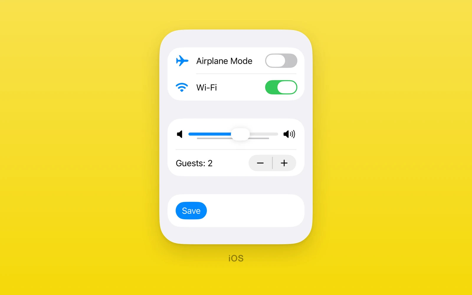
Pressable and value controls under One.iOS, drawn by SwiftUI.
Toggle,Slider, andStepperare controlled: a value, a change callback, and arevisionfor external resets.Buttontakes a label and SF Symbol, or React children.PasteButton,ShareLink, andSignInWithAppleButtonwrap system flows.- Every control throws on web and Android. Keep them in an iOS branch or an
.ios.tsxfile.
Usage
import { useState } from 'react'import { One } from 'one'
export function SoundSettings() {  const [muted, setMuted] = useState(false)  const [volume, setVolume] = useState(50)
  return (    <One.iOS.Form style={{ flex: 1 }}>      <One.iOS.Section title="Sound">        <One.iOS.Toggle label="Mute" isOn={muted} onIsOnChange={setMuted} />        <One.iOS.Slider          label="Volume"          value={volume}          onValueChange={setVolume}          minimumValueImage="speaker.fill"          maximumValueImage="speaker.wave.3.fill"        />        <One.iOS.Button label="Save" systemImage="checkmark" onPress={save} />      </One.iOS.Section>    </One.iOS.Form>  )}
To reset a controlled value from outside, set the new value and increase
revision in the same render.
Shared props
Every control on this page also accepts accessibilityLabel,
accessibilityHint, accessibilityValue, testID, style, onLayout, and
swiftStyle. Most accept disabled; EditButton and
SignInWithAppleButton do not.
Button
One.iOS.Button runs onPress when tapped. It takes either a label or
children, never both, and needs at least a label, a systemImage, or
children.
| Props | Type | Description |
|---|---|---|
onPress() => voidRuns when tapped. | () => void | Runs when tapped. |
labelstring = ""The title. | string = "" | The title. |
systemImagestring = ""An SF Symbol shown with the title. | string = "" | An SF Symbol shown with the title. |
subtitlestring = ""A second line under the title. | string = "" | A second line under the title. |
buttonRoleButtonRole | "" = ""destructive, cancel, confirm, or close. | ButtonRole | "" = "" | destructive, cancel, confirm, or close. |
buttonStylePrimitiveButtonStyle = "automatic"automatic, glass, glassProminent, borderless, plain, bordered, or borderedProminent. | PrimitiveButtonStyle = "automatic" | automatic, glass, glassProminent, borderless, plain, bordered, or borderedProminent. |
disclosureIndicatorboolean = falseShows a chevron, as in a navigation row. | boolean = false | Shows a chevron, as in a navigation row. |
disabledboolean = falseDims the button and ignores taps. | boolean = false | Dims the button and ignores taps. |
childrenReactNodeCustom content in place of label and systemImage. | ReactNode | Custom content in place of label and systemImage. |
Use swiftStyle={{ controlSize: 'extraLarge' }} to apply SwiftUI’s
.controlSize(_:) to a standalone Button. On an iOS 27 simulator, a bordered
prominent Button grew from 28 to 50.33 points when changed from mini to
extraLarge, then returned to 28 points.
Toggle
One.iOS.Toggle is a labeled switch.
| Props | Type | Description |
|---|---|---|
isOn (required)boolean | NativeState<boolean>Whether the switch is on, or a useNativeState handle. | boolean | NativeState<boolean> | Whether the switch is on, or a useNativeState handle. |
onIsOnChange (required)(value: boolean) => voidA native flip, with the new value. | (value: boolean) => void | A native flip, with the new value. |
revisionnumber = 0Increase with a new isOn to reset it from outside. | number = 0 | Increase with a new isOn to reset it from outside. |
labelstringThe text before the switch. | string | The text before the switch. |
systemImagestringAn SF Symbol before the label. | string | An SF Symbol before the label. |
toggleStyleToggleStyle = "automatic"automatic, switch, or button. | ToggleStyle = "automatic" | automatic, switch, or button. |
disabledbooleanDims the toggle and ignores taps. | boolean | Dims the toggle and ignores taps. |
Slider
One.iOS.Slider picks a number in a range.
| Props | Type | Description |
|---|---|---|
value (required)numberThe current value. | number | The current value. |
onValueChange (required)(value: number) => voidA native drag, with the new value. | (value: number) => void | A native drag, with the new value. |
revisionnumber = 0Increase with a new value to reset it from outside. | number = 0 | Increase with a new value to reset it from outside. |
labelstringRead by VoiceOver. A form row does not draw it. | string | Read by VoiceOver. A form row does not draw it. |
minimumValuenumber = 0The low end of the range. | number = 0 | The low end of the range. |
maximumValuenumber = 100The high end of the range. | number = 100 | The high end of the range. |
stepnumber = 1The increment between values. | number = 1 | The increment between values. |
minimumValueLabelstringText at the low end. | string | Text at the low end. |
maximumValueLabelstringText at the high end. | string | Text at the high end. |
minimumValueImagestringAn SF Symbol at the low end. | string | An SF Symbol at the low end. |
maximumValueImagestringAn SF Symbol at the high end. | string | An SF Symbol at the high end. |
disabledbooleanDims the slider and ignores drags. | boolean | Dims the slider and ignores drags. |
The value must lie within the range, the minimum must be below the maximum, and the step must be above zero, or the slider throws during render.
Stepper
One.iOS.Stepper steps a number up and down.
| Props | Type | Description |
|---|---|---|
value (required)numberThe current value. | number | The current value. |
onValueChange (required)(value: number) => voidA native step, with the new value. | (value: number) => void | A native step, with the new value. |
revisionnumber = 0Increase with a new value to reset it from outside. | number = 0 | Increase with a new value to reset it from outside. |
labelstringThe text before the buttons. | string | The text before the buttons. |
minimumValuenumber = 0The lowest value. | number = 0 | The lowest value. |
maximumValuenumber = 100The highest value. | number = 100 | The highest value. |
stepnumber = 1The amount each tap adds or removes. | number = 1 | The amount each tap adds or removes. |
disabledbooleanDims the stepper and ignores taps. | boolean | Dims the stepper and ignores taps. |
Stepper throws on the same invalid ranges as Slider.
PasteButton
One.iOS.PasteButton renders SwiftUI’s system Paste button for strings.
SwiftUI performs the paste without the usual pasteboard prompt. It has the
system label, so label and systemImage are not props.
<One.iOS.PasteButton onPaste={(values) => setText(values.join('\n'))} />| Props | Type | Description |
|---|---|---|
onPaste(values: readonly string[]) => voidEvery string from one paste. | (values: readonly string[]) => void | Every string from one paste. |
disabledbooleanDims the button and ignores taps. | boolean | Dims the button and ignores taps. |
ShareLink
One.iOS.ShareLink opens the system share sheet for one item. It does not
report completion.
<One.iOS.ShareLink label="Share" item="https://onestack.dev" itemType="url" />| Props | Type | Description |
|---|---|---|
labelstringThe button title. | string | The button title. |
systemImagestringAn SF Symbol shown with the title. | string | An SF Symbol shown with the title. |
itemstringThe text or URL to share. | string | The text or URL to share. |
itemType"text" | "url"How iOS receives the item. A URL gets a link preview. | "text" | "url" | How iOS receives the item. A URL gets a link preview. |
subjectstringA subject, for activities such as Mail. | string | A subject, for activities such as Mail. |
messagestringText shared with the item. | string | Text shared with the item. |
disabledbooleanDims the button and ignores taps. | boolean | Dims the button and ignores taps. |
For a text item, the system Copy activity copies the item and message as
text. Changing item and itemType changes what the next share sheet
receives.
SignInWithAppleButton
One.iOS.SignInWithAppleButton starts the Apple sign in flow.
| Props | Type | Description |
|---|---|---|
onCompletion(completion: SignInWithAppleButtonCompletion) => voidThe result: success, failed, or cancelled. | (completion: SignInWithAppleButtonCompletion) => void | The result: success, failed, or cancelled. |
requestedScopesreadonly ("fullName" | "email")[]The user details to request. | readonly ("fullName" | "email")[] | The user details to request. |
noncestringA replay protection nonce passed through to Apple. | string | A replay protection nonce passed through to Apple. |
label"signIn" | "continue" | "signUp"The system button title. | "signIn" | "continue" | "signUp" | The system button title. |
A completion is { type: 'success', user, email, givenName, familyName, identityToken, authorizationCode }, { type: 'failed', message }, or
{ type: 'cancelled' }.
EditButton
One.iOS.EditButton is SwiftUI’s edit button, with only the shared props.
Put it inside a native One.iOS.List. Its label changes from Edit to
Done and back when tapped.
<One.iOS.List> <One.iOS.Section title="Items"> <One.iOS.EditButton /> <One.iOS.Text text="Alpha" /> <One.iOS.Text text="Beta" /> </One.iOS.Section></One.iOS.List>List does not expose SwiftUI row deletion or moves yet, so the button only
switches its own label.
Edit this page on GitHub.