iOS Tabs and Pager
Tabs, Tab, TabSection, TabViewSlot, TabViewBottomAccessory, Pager, and Page under One.iOS
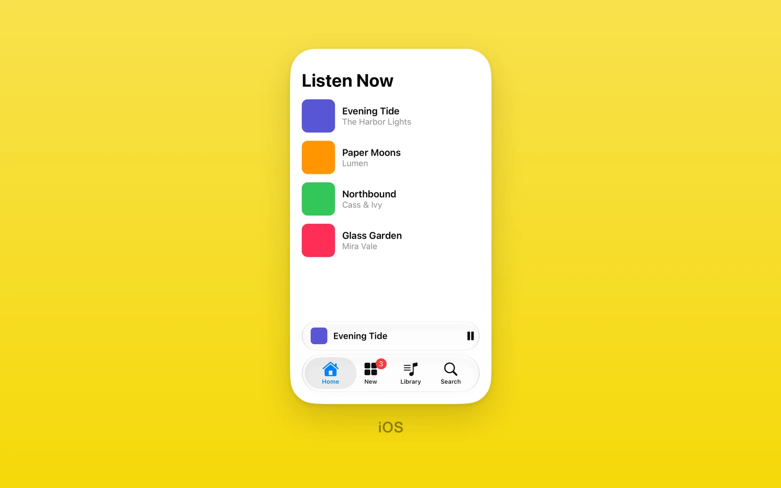
Tab navigation and swipe paging under One.iOS, drawn by SwiftUI.
Tabsis controlled: aselection, anonSelectionChangecallback, and arevisionfor external resets.onReselectreports a tap on the selected tab.Tabis a page, or an action tab that runsonPressand never becomes the selection.TabSectiongroups tabs in the iPad sidebar;TabViewSlotandTabViewBottomAccessoryadd content around the bar.Pagerswipes between pages with no bar.- Every view here throws on web and Android. Keep them in an iOS branch or an
.ios.tsxfile.
Tabs
One.iOS.Tabs is a SwiftUI tab view. Only Tab, TabSection,
TabViewSlot, and TabViewBottomAccessory may be its direct children.
Each tab’s navigation container is transparent on iOS 18 and later, so the system bar can show the content behind it. Your page owns its background.
import { One } from 'one'
<One.iOS.Tabs selection={tab} onSelectionChange={setTab}> <One.iOS.Tab id="feed" title="Feed" systemImage="house"> <FeedScreen /> </One.iOS.Tab> <One.iOS.Tab id="new" title="New" systemImage="plus" onPress={openComposer} /></One.iOS.Tabs>| Props | Type | Description |
|---|---|---|
selection (required)stringThe id of the selected page tab. | string | The id of the selected page tab. |
onSelectionChange (required)(id: string) => voidA native tab change, with the new id. | (id: string) => void | A native tab change, with the new id. |
onReselect(id: string) => voidA tap on the selected tab outside a TabSection, with its id. | (id: string) => void | A tap on the selected tab outside a TabSection, with its id. |
revisionnumber = 0Increase with a new selection to reset it from outside. | number = 0 | Increase with a new selection to reset it from outside. |
tabViewStyleTabViewStyle = "automatic"automatic, sidebarAdaptable, tabBarOnly, or page. | TabViewStyle = "automatic" | automatic, sidebarAdaptable, tabBarOnly, or page. |
tabBarVisibilityVisibility = "automatic"The tab bar on every page: automatic, visible, or hidden. | Visibility = "automatic" | The tab bar on every page: automatic, visible, or hidden. |
customizationstring = ""Saved tab customization JSON, from onCustomizationChange. | string = "" | Saved tab customization JSON, from onCustomizationChange. |
onCustomizationChange(customization: string) => voidPeople reordered or hid tabs. Persist the JSON. | (customization: string) => void | People reordered or hid tabs. Persist the JSON. |
swiftStyleOneNativeStyleSwiftUI modifiers on the tab view. | OneNativeStyle | SwiftUI modifiers on the tab view. |
children (required)ReactNodeTab, TabSection, TabViewSlot, and TabViewBottomAccessory elements. | ReactNode | Tab, TabSection, TabViewSlot, and TabViewBottomAccessory elements. |
selection must name a mounted page tab, or Tabs throws. Sections, tab
modifiers, styles, and customization need iOS 18.
Tab
One.iOS.Tab is one tab. It takes either children, as a page, or onPress,
as an action tab, never both. Ids must be unique and nonempty.
| Props | Type | Description |
|---|---|---|
id (required)stringIdentifies the tab in selection. | string | Identifies the tab in selection. |
title (required)stringThe tab label. | string | The tab label. |
systemImagestringAn SF Symbol. Not with image. | string | An SF Symbol. Not with image. |
imagestringAn asset catalog image. Not with systemImage. | string | An asset catalog image. Not with systemImage. |
labelStyleSDKLabelStyleiconOnly keeps the title for VoiceOver only. | SDKLabelStyle | iconOnly keeps the title for VoiceOver only. |
badgestring | numberA badge on the tab item. | string | number | A badge on the tab item. |
roleTabRolesearch or prominent, the SwiftUI tab roles. | TabRole | search or prominent, the SwiftUI tab roles. |
tabPlacementTabPlacementautomatic, pinned, or sidebarOnly. | TabPlacement | automatic, pinned, or sidebarOnly. |
testIDstringIdentifies the page in tests. | string | Identifies the page in tests. |
onPress() => voidMakes an action tab, which runs this and keeps the selection. | () => void | Makes an action tab, which runs this and keeps the selection. |
swiftStyleOneNativeStyleSwiftUI modifiers on the page content. | OneNativeStyle | SwiftUI modifiers on the page content. |
childrenReactNodeThe page. | ReactNode | The page. |
Tab and TabSection share these SwiftUI tab modifiers:
| Modifiers | Type | Description |
|---|---|---|
disabledbooleanDims the tab. iOS 18.4 or later. | boolean | Dims the tab. iOS 18.4 or later. |
hiddenbooleanRemoves the tab from the bar and sidebar. | boolean | Removes the tab from the bar and sidebar. |
customizationIDstringLets people reorder or hide the tab. | string | Lets people reorder or hide the tab. |
customizationBehavior{ behavior: TabCustomizationBehavior for?: readonly AdaptableTabBarPlacement[] }automatic, reorderable, or disabled, for the listed placements. | { behavior: TabCustomizationBehavior for?: readonly AdaptableTabBarPlacement[] } | automatic, reorderable, or disabled, for the listed placements. |
defaultVisibility{ visibility: Visibility for?: readonly AdaptableTabBarPlacement[] }Shown or hidden until people customize, for the listed placements. | { visibility: Visibility for?: readonly AdaptableTabBarPlacement[] } | Shown or hidden until people customize, for the listed placements. |
springLoadingBehaviorSpringLoadingBehaviorWhether a drag hovering the tab opens it. | SpringLoadingBehavior | Whether a drag hovering the tab opens it. |
accessibilityLabelstringRead by VoiceOver in place of the title. | string | Read by VoiceOver in place of the title. |
accessibilityHintstringWhat selecting the tab does. | string | What selecting the tab does. |
accessibilityValuestringThe tab's current value. | string | The tab's current value. |
accessibilityIdentifierstringIdentifies the tab item in UI tests. | string | Identifies the tab item in UI tests. |
helpstringHelp text for the tab. iOS 27 or later. | string | Help text for the tab. iOS 27 or later. |
TabSection
One.iOS.TabSection groups tabs under a heading in the sidebar. Its children
are Tab elements, at least one.
| Props | Type | Description |
|---|---|---|
id (required)stringIdentifies the section. | string | Identifies the section. |
title (required)stringThe section heading. | string | The section heading. |
defaultSectionExpansionTabSectionExpansionautomatic, expanded, or collapsed at first. | TabSectionExpansion | automatic, expanded, or collapsed at first. |
sectionActionsreadonly { id: string title: string systemImage?: string onPress: () => void }[]Buttons in the section header. | readonly { id: string title: string systemImage?: string onPress: () => void }[] | Buttons in the section header. |
children (required)ReactNodeThe tabs. | ReactNode | The tabs. |
TabViewSlot
One.iOS.TabViewSlot fills a named tab view slot with React Native content.
| Props | Type | Description |
|---|---|---|
name (required)TabViewSlotNametabViewBottomAccessory (iOS 26), or a sidebar slot (iOS 18). | TabViewSlotName | tabViewBottomAccessory (iOS 26), or a sidebar slot (iOS 18). |
height (required)numberThe slot height in points. Must be above zero. | number | The slot height in points. Must be above zero. |
children (required)ReactNodeThe slot content. | ReactNode | The slot content. |
The sidebar slots are tabViewSidebarHeader, tabViewSidebarFooter, and
tabViewSidebarBottomBar. Each name may appear once. The three sidebar slots display only when the tab view presents a sidebar;
they are absent from the compact iPhone tab bar.
Place it directly inside Tabs, alongside the Tab children. The bottom
accessory remains above the system tab bar as selection changes; its React
Native children keep their event handlers.
On iPad, use tabViewStyle="sidebarAdaptable" to present the native sidebar.
tabViewSidebarHeader and tabViewSidebarFooter sit above the sidebar bottom
bar; tabViewSidebarBottomBar spans the bottom of the sidebar. Each slot keeps
its declared height and React Native actions when the sidebar is open. Selecting
a tab closes the sidebar on iPad; reopening it shows the slots for the selected
tab.
import { One } from 'one'import { Pressable, Text } from 'react-native'
<One.iOS.Tabs selection={tab} onSelectionChange={setTab}> <One.iOS.Tab id="home" title="Home" systemImage="house">...</One.iOS.Tab> <One.iOS.Tab id="other" title="Other" systemImage="star">...</One.iOS.Tab> <One.iOS.TabViewSlot name="tabViewBottomAccessory" height={50}> <Pressable onPress={openPlayer}><Text>Open player</Text></Pressable> </One.iOS.TabViewSlot></One.iOS.Tabs><One.iOS.Tabs tabViewStyle="sidebarAdaptable" selection={tab} onSelectionChange={setTab}> <One.iOS.Tab id="home" title="Home" systemImage="house">...</One.iOS.Tab> <One.iOS.Tab id="other" title="Other" systemImage="star">...</One.iOS.Tab> <One.iOS.TabViewSlot name="tabViewSidebarHeader" height={44}> <Pressable onPress={openSearch}><Text>Search</Text></Pressable> </One.iOS.TabViewSlot> <One.iOS.TabViewSlot name="tabViewSidebarFooter" height={48}> <Pressable onPress={openSettings}><Text>Settings</Text></Pressable> </One.iOS.TabViewSlot> <One.iOS.TabViewSlot name="tabViewSidebarBottomBar" height={52}> <Pressable onPress={openProfile}><Text>Profile</Text></Pressable> </One.iOS.TabViewSlot></One.iOS.Tabs>TabViewBottomAccessory
One.iOS.TabViewBottomAccessory sits above the tab bar, like a music
player’s now playing bar. It needs iOS 26, and Tabs takes one.
| Props | Type | Description |
|---|---|---|
isEnabledbooleanHides the accessory without remounting it. iOS 26.1 or later. | boolean | Hides the accessory without remounting it. iOS 26.1 or later. |
childrenReactNodeContent for both layouts. | ReactNode | Content for both layouts. |
inlineReactNodeContent while the bar is minimized beside it. | ReactNode | Content while the bar is minimized beside it. |
expandedReactNodeContent above the full bar. | ReactNode | Content above the full bar. |
It needs children, inline, or expanded. A missing layout falls back to
the others.
Pager, Page
One.iOS.Pager is a tab view without the bar: people swipe between pages.
Children must be Page elements with unique nonempty ids, and selection
must name a mounted page. For a pager on both platforms, use
One.UI.Pager.
import { One } from 'one'
<One.iOS.Pager selection={page} onSelectionChange={setPage}> <One.iOS.Page id="one">...</One.iOS.Page> <One.iOS.Page id="two">...</One.iOS.Page></One.iOS.Pager>| Pager | Type | Description |
|---|---|---|
selection (required)stringThe id of the shown page. | string | The id of the shown page. |
onSelectionChange (required)(id: string) => voidA swipe to another page. | (id: string) => void | A swipe to another page. |
revisionnumber = 0Increase with a new selection to reset it from outside. | number = 0 | Increase with a new selection to reset it from outside. |
children (required)ReactNodePage elements. | ReactNode | Page elements. |
| Page | Type | Description |
|---|---|---|
id (required)stringIdentifies the page in selection. | string | Identifies the page in selection. |
testIDstringIdentifies the page in tests. | string | Identifies the page in tests. |
children (required)ReactNodeThe page content. | ReactNode | The page content. |
Edit this page on GitHub.